Creating a customer-facing bus travel hub for the North East Mayoral Strategic Authority
- Clearer user journeys for high-volume public transport campaigns
- Interactive location tools to make bus offers easier to use
- Restructured content aligned to regional transport priorities
The Ambition
The North East Mayoral Strategic Authority needed to modernise its existing bus travel microsite: a functional but outdated platform that was receiving increasing levels of traffic from major public-facing campaigns.
Multiple initiatives, including Mayor’s Fares, Kids Go Free and Days Out by Bus, were being promoted heavily across the region through bus advertising, cinema and wider campaign activity. The microsite was the destination for that traffic, but it was no longer doing enough to explain the value of those schemes clearly or present them in a way that felt engaging, useful and easy to navigate.
The brief was not to rebuild the proposition, but to make it work harder. That meant rethinking the structure, refreshing the design system in line with newer regional branding, and improving the way users accessed practical information about fares, discounts and destinations. The site needed to support a broad audience, from regular commuters checking fare information to families looking for affordable days out, without overcomplicating the experience.
The objective was to create a clearer, more useful microsite that better reflected the Mayoral Strategic Authority’s investment in bus travel, and gave residents a more direct route into the schemes and benefits available to them.
Reframing the microsite around user value
A core part of the work was content design. The previous site contained the right information, but it was not structured in a way that clearly communicated what the schemes meant in practice for residents or communicated them in an appealing way that would encourage people to get out and explore the region by bus.
Working closely with the client team, we restructured the site around the outcomes that matter most to users - cheaper fares, better value, improved accessibility and simpler access to offers. This helped translate a set of transport initiatives into plain-English benefits, while still accurately reflecting the Mayoral Strategic Authority’s wider strategic role in improving public transport across the region.
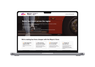
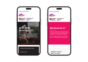
That shift is most visible on the homepage, where the proposition was rewritten to make the offer immediately legible. Rather than requiring users to interpret policy or scheme language, the site now sets out in direct terms what is changing and why it matters.

Applying a more coherent visual identity
The refresh also brought the microsite into closer alignment with the Mayoral Strategic Authority’s evolving branding. We introduced updated visual elements, including the newer graphic system, to create a stronger sense of consistency with wider campaign activity.
We also integrated campaign video and imagery to improve the quality of the experience and make bus travel feel more immediate, practical and appealing. This was particularly important given the level of promotional spend driving users to the site - the destination needed to feel current, credible and fit for purpose.
The result is a platform that is still straightforward in structure, but significantly stronger in presentation and usability.
Interactive map feature
The most substantial functional improvement was within the Days Out by Bus section.
Previously, this offer was presented in a far less usable format, with destinations and discounts surfaced in a way that made browsing difficult. We reworked that section to make it more exploratory and much easier to use, introducing a clearer content hierarchy and a more inviting route into the available offers.
The key addition was an interactive map-based journey planner, allowing users to browse participating venues more intuitively and identify destinations near them. This transformed what had been a static content list into a more practical location tool, particularly for mobile users or those making spontaneous travel decisions.
From a user experience perspective, this matters because the scheme is only as strong as its discoverability. The map made the offer tangible, surfacing the scale of what was available and making regional exploration by bus feel more achievable.
Structuring for multiple public audiences
Although the microsite is focused on bus offers, it still needs to support very different user intents. Some visitors arrive looking for straightforward fare information while others are browsing for leisure options or family discounts. Some will be highly confident online, while others will not.
With this in mind the Enigma team kept the interaction model simple and the information architecture intentionally lightweight. Key content is surfaced quickly, terms are easy to locate where needed, and pages are structured to reduce friction rather than add explanation for its own sake.
That balance was important. The site needed to be accessible and informative, but also efficient. In practice, that meant removing clutter, reducing overreliance on long-form text and designing journeys that worked equally well for quick fact-finding and more exploratory browsing.


Improved imagery
Stronger, more purposeful imagery repositions bus travel as a gateway to the region rather than simply a mode of transport. High-quality photography and campaign footage were integrated throughout the site to showcase destinations across the North East in a more aspirational and visually engaging way, helping users see what they could access by bus rather than just how to get there. This shift made the “Days Out by Bus” proposition feel tangible and appealing, encouraging exploration and discovery.
Alongside this, the use of light-touch visual devices, including emojis, helped create a more consistent and approachable tone across channels. These elements break up content into more digestible sections, improve scannability on mobile, and reflect familiar patterns from social media, making the experience feel more accessible and aligned with the expectations of the target audience.
Results

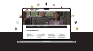
The refreshed microsite gives the North East Mayoral Strategic Authority a more effective platform for its bus travel campaigns, one that better matches the quality and visibility of the schemes it promotes.
By restructuring the content, introducing a clearer visual system and adding more useful interactive tools, the site now does a better job of helping residents understand what is available to them and how to use it. In particular, the Days Out by Bus experience demonstrates how relatively focused digital improvements can significantly increase the usefulness and appeal of a public information service.

The project shows what can be achieved when content design, UX thinking and lightweight functional development are applied to an existing platform with clear strategic intent.

Related Projects
Start a Project
Would you like to do a project like this with us?


Results
Sort by:
Type:
From {{ group.title }}
Sorry, there are no results to show